Introduction to Looker Studio
Looker Studio is a powerful data visualization and business intelligence tool that empowers users to create insightful dashboards and reports. Designed for data analysts and business stakeholders alike, Looker Studio simplifies the process of converting raw data into meaningful visual representations. The primary purpose of this platform is to enable organizations to make informed decisions based on data-driven insights. By leveraging Looker Studio, users can uncover trends, monitor performance metrics, and visualize complex data sets in a user-friendly interface.
Dashboards play a crucial role in data visualization as they aggregate multiple data points into a cohesive view, facilitating easy interpretation of information. A well-structured dashboard allows for real-time monitoring of key performance indicators (KPIs), helping users to identify areas for improvement and opportunities for growth. Looker Studio streamlines this process, offering an intuitive design that allows users to customize their dashboards to meet specific analytical needs. These custom dashboards not only improve data comprehension but also foster collaboration across teams as they share insights derived from visualized data.
One of the distinguishing features of Looker Studio is its ability to connect seamlessly to numerous data sources. Whether it be relational databases, cloud storage solutions, or popular applications like Google Analytics, Looker Studio simplifies the integration process. Users can connect and blend data from various sources, enabling comprehensive analysis without the need for complicated coding or manual data extraction. This connectivity is essential for amplification of data exploration and analysis, ensuring that users have access to the most relevant data for informed decision-making.
Ultimately, Looker Studio provides a robust platform for creating dynamic dashboards, helping users visualize data and derive actionable insights effectively. Through its versatile capabilities, including customizable dashboards and easy data source connections, it stands out as an essential tool for anyone looking to harness the power of their data.
Setting Up Your Looker Studio Account
Creating a Looker Studio account is the first step in harnessing the full potential of this powerful data analysis and visualization tool. To begin, you will need a Google account, as Looker Studio is integrate with Google services. If you do not have a Google account, it is advisable to create one to ensure a smooth sign-up process.
Once you have your Google account ready, navigate to the Looker Studio homepage. Here, you can find the “Sign In” button located at the top right corner. Click on this button, and it will redirect you to your Google account login page. Enter your credentials, and you will be granted access to Looker Studio. If you already have access to an existing Looker Studio account, these steps will similarly apply. However, ensure you have the necessary permissions to access the shared dashboards and reports.
The Looker Studio interface is designed for ease of use, featuring a user-friendly layout that allows new users to quickly familiarize themselves with its functions. Upon logging in, you will be greeted by the dashboard, which showcases all your existing reports and data sources. An overview of recently accessed projects will also be presented, providing a convenient way to resume work on ongoing analytics.
To familiarize yourself further, explore the navigation bar situated on the left side of the interface. This area includes essential tools such as “Reports,” “Data Sources,” and “Scheduled Reports.” These tools are vital for setting up your dashboards. The “Create” button at the top left corner is particularly important as it enables you to initiate new reports and incorporate data from various sources. Understanding the layout and capabilities of the interface cultivates a foundational knowledge that will assist you as you start creating your first Looker Studio dashboard.
Connecting Data Sources to Your Dashboard
Creating an effective Looker Studio dashboard starts with connecting the right data sources. This process is essential for delivering accurate insights and ensuring that your visuals reflect real-time data. To begin, identify the data sources you plan to utilize, including spreadsheets, databases, or third-party applications. Understanding the type of data each source offers will aid in establishing a cohesive dashboard.
To connect a data source, open your Looker Studio dashboard and follow these steps:
- In the dashboard creation menu, click on the “Add Data” button.
- Select the type of source you wish to connect. For instance, if you are using Google Sheets, choose the corresponding option from the available data connectors.
- If prompted, sign into your account and authorize Looker Studio to access your data. Ensure the permissions are set correctly to allow data integration.
- Once authenticated, select the specific document or database you want to link, ensuring that the dataset is compatible with Looker Studio.
- Confirm the data fields that should be included in your dashboard. This can help reduce clutter and enhance usability.
Data compatibility is crucial; proving the effectiveness of your dashboard hinges on accurate data representation. Make sure the formats match and that the data ranges are aligned to avoid discrepancies. Conduct a quick validation by running sample queries on your data connections to check for accuracy and reliability.
Should you encounter issues during the connection process, troubleshooting steps can include checking network connections, revisiting data permissions, and confirming that the data source format aligns with Looker Studio’s supported types. By following these outlined steps, the integration of various data sources will facilitate a robust foundation for your dashboard, enabling you to analyze trends and visualize insights effectively.
Designing and Customizing Your Dashboard
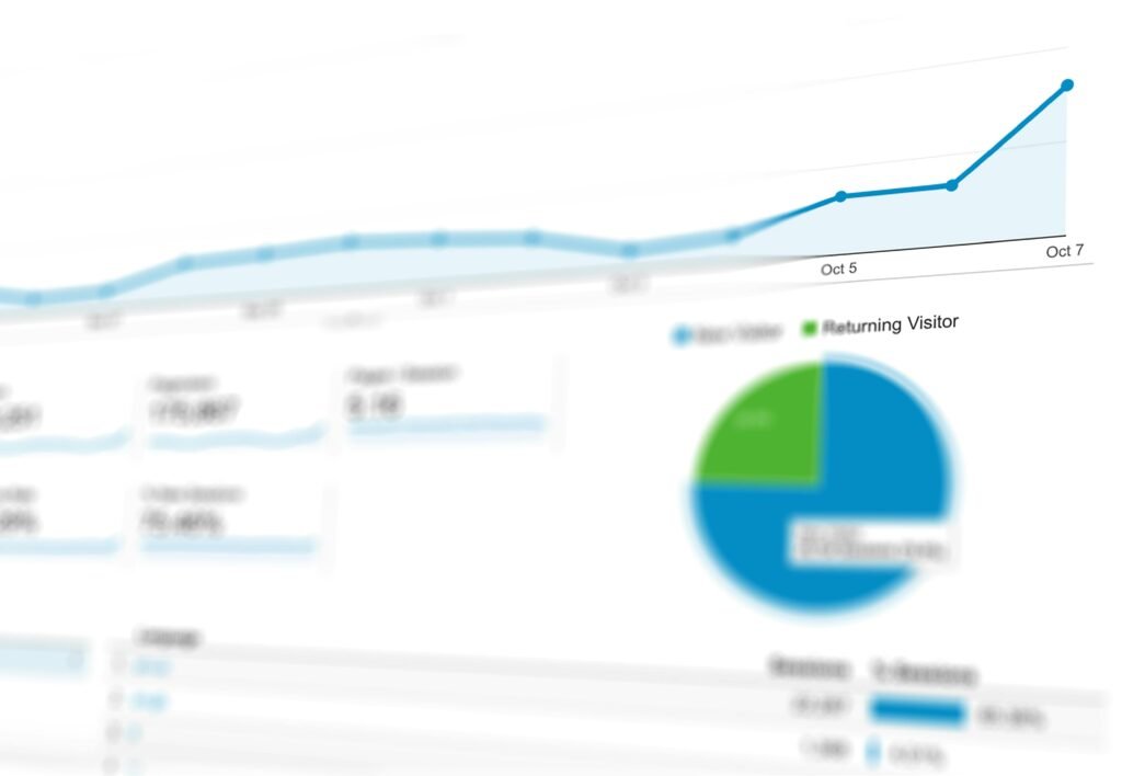
Once your data sources are successfully connected in Looker Studio, the next critical step is designing and customizing your dashboard to ensure it effectively communicates the insights you aim to present. The selection of the right chart types is paramount. Depending on the nature of your data, using bar charts for comparisons, line charts for trends, or pie charts for proportional insights can significantly enhance clarity and user engagement.
Additionally, visual elements such as color schemes, fonts, and iconography should align with your intended message and audience. A well-chosen color palette not only makes the dashboard visually appealing but also improves readability. For example, contrasting colors can help in distinguishing data sets, while softer tones may promote an overall soothing appearance. When selecting fonts, ensure they are legible and maintain consistency across the dashboard.
Layout considerations play a pivotal role in how effectively stakeholders can glean insights from your dashboard. Following the ‘F-pattern’ layout principle often used in web design can direct users’ attention to critical data points. Place the most important metrics at the top or on the left side, as these areas typically capture the eye first. Furthermore, incorporating white space is essential—it prevents the dashboard from feeling overcrowded and allows users to focus on the key visualizations without unnecessary distractions.
To enhance interactivity, Looker Studio provides various features such as filters and hover effects that engage users and allow for a personalized experience. These functionalities enable users to explore data by drilling down into specifics according to their needs. Once satisfied with your design and customizations, you can save your dashboard efficiently. Sharing it with team members and stakeholders is streamlined within Looker Studio, and the option to publish the dashboard ensures that your efforts reach a broader audience, maximizing the impact of your data storytelling.